Post by prisonerno6 on Oct 24, 2013 8:52:27 GMT -5
Written By: Chris Creamer • Wednesday, October 23, 2013 • sportslogos.net
Yesterday the Triple-A Pacific Coast League officially welcomed it’s newest team as the re-located Tucson Padres announced they would be known as the El Paso Chihuahuas for the 2014 season.
The Chihuahuas (I will make it my goal to learn how to spell that by the end of this post) name comes following a name-the-team contest, fans submitted names, five finalists were announced, and Chi-hua-huas (it’s easier to spell if you break it down like that) was picked by the team from those finalists. The other finalist names were Desert Gators, Sun Dogs, Aardvarks, and Buckaroos.
“First and foremost, we want to appeal to kids and families. Look at the name and logos through the eyes of a child and you can’t help but smile, that’s what we’re all about.” – said team president Alan Ledford, explaining the blatantly obvious. “El Pasoans played a significant role in identifying our new team name — they attended focus groups, suggested several hundred different names, and voted in record numbers(?) for all the names.”
Of all the fans to submit the name Chi-hua-huas (starting to get this now), one was drawn at random and chosen as the one who gave the team it’s moniker. Shae Vierra will be awarded two season tickets, a customized team jersey, and will throw out one of the several first pitches before the opening game.
According to the press release, the Chi-huahuas (that second part is repeated, got it) name was picked “primarily to represent El Paso’s spirit and fiercely-loyal community, and recognize the region’s location in the Chihuahuan Desert”. Just to add a fun little editorial note, a name like “El Paso El Pasoans” would have also represented these things as well as being much more fun (and easier to spell). Plus they could have renewed the old Springfield/Shelbybille Shelbyvillians rivalry with the Albuquerque Isotopes.
Moving away from the lame attempts at comedy and onto the logos, they were designed by Brandiose who are the all-stars of Minor League Baseball branding these days having also recently rebranded the Reading Fightin’ Phils, Scranton/Wilkes-Barre Railriders, and Eugene Emeralds, amongst a host of others.
Team colours are desert red, black, and “Chihuahua tan”, to represent the City of El Paso (who’s city flag is actually blue, yellow, and green).
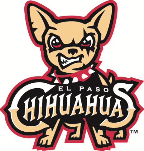
The primary logo features an angry little chihuahua (totally got that spelling down now) snarling toward the viewer while wearing a spiked red collar and the team name in front of it… because kids love to smile at angry dogs wearing spiked collars.
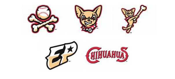
There’s a whole host of alternate logos, as is the custom with a Brandiose-designed identity (not a criticism), one features a chihuahua swinging a dog bone like a baseball bat (a nod to the Padres swinging friar logo), another a stylized “EP” with a star in the middle of the “P” to represent El Paso’s “Mountain Star”, and one with two crossed dog bones framing a baseball.
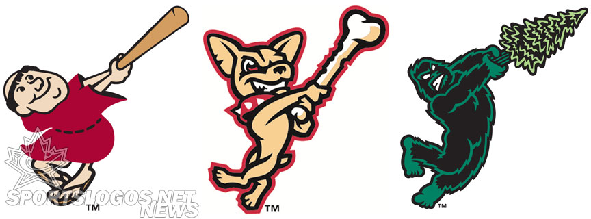
Brandiose has used the “Swinging Friar” homage before, their re-design of the Eugene Emeralds, also a Padres affiliate, featured a Sasquatch character swinging a pine tree. Before I made the connection that these were all Padres affiliates I has just assumed Brandiose was getting lazy, turns out it’s just the opposite actually. I absolutely love the connection between the affiliates while all still maintaining their own individual identities, well done boys!

Yesterday the Triple-A Pacific Coast League officially welcomed it’s newest team as the re-located Tucson Padres announced they would be known as the El Paso Chihuahuas for the 2014 season.
The Chihuahuas (I will make it my goal to learn how to spell that by the end of this post) name comes following a name-the-team contest, fans submitted names, five finalists were announced, and Chi-hua-huas (it’s easier to spell if you break it down like that) was picked by the team from those finalists. The other finalist names were Desert Gators, Sun Dogs, Aardvarks, and Buckaroos.
“First and foremost, we want to appeal to kids and families. Look at the name and logos through the eyes of a child and you can’t help but smile, that’s what we’re all about.” – said team president Alan Ledford, explaining the blatantly obvious. “El Pasoans played a significant role in identifying our new team name — they attended focus groups, suggested several hundred different names, and voted in record numbers(?) for all the names.”
Of all the fans to submit the name Chi-hua-huas (starting to get this now), one was drawn at random and chosen as the one who gave the team it’s moniker. Shae Vierra will be awarded two season tickets, a customized team jersey, and will throw out one of the several first pitches before the opening game.

According to the press release, the Chi-huahuas (that second part is repeated, got it) name was picked “primarily to represent El Paso’s spirit and fiercely-loyal community, and recognize the region’s location in the Chihuahuan Desert”. Just to add a fun little editorial note, a name like “El Paso El Pasoans” would have also represented these things as well as being much more fun (and easier to spell). Plus they could have renewed the old Springfield/Shelbybille Shelbyvillians rivalry with the Albuquerque Isotopes.
Moving away from the lame attempts at comedy and onto the logos, they were designed by Brandiose who are the all-stars of Minor League Baseball branding these days having also recently rebranded the Reading Fightin’ Phils, Scranton/Wilkes-Barre Railriders, and Eugene Emeralds, amongst a host of others.
Team colours are desert red, black, and “Chihuahua tan”, to represent the City of El Paso (who’s city flag is actually blue, yellow, and green).
The primary logo features an angry little chihuahua (totally got that spelling down now) snarling toward the viewer while wearing a spiked red collar and the team name in front of it… because kids love to smile at angry dogs wearing spiked collars.
There’s a whole host of alternate logos, as is the custom with a Brandiose-designed identity (not a criticism), one features a chihuahua swinging a dog bone like a baseball bat (a nod to the Padres swinging friar logo), another a stylized “EP” with a star in the middle of the “P” to represent El Paso’s “Mountain Star”, and one with two crossed dog bones framing a baseball.

Brandiose has used the “Swinging Friar” homage before, their re-design of the Eugene Emeralds, also a Padres affiliate, featured a Sasquatch character swinging a pine tree. Before I made the connection that these were all Padres affiliates I has just assumed Brandiose was getting lazy, turns out it’s just the opposite actually. I absolutely love the connection between the affiliates while all still maintaining their own individual identities, well done boys!

El Paso baseball fans seem less than enthusiastic about cheering on a team designed primarily with kids in mind (as a fan of the Toronto Raptors, I can relate), a petition has actually started up and is doing surprisingly well, although they’ll never change the name because of it. I expected to check it and find only 10-20 signatures on it but as of the time of this post it’s up to over 6,000.
Their reasons? From the petition…
“We feel that the team name they decided upon, “The Chihuahuas” strongly misrepresents our great city of El Paso. El Pasoans have shown numerous reasons as to why we oppose this name, ranging from ‘non-intimidating’ and ‘stereotypically offensive’ to downright ‘ugly’”.
I certainly can’t agree with the ugly part, the logos aren’t bad at all.
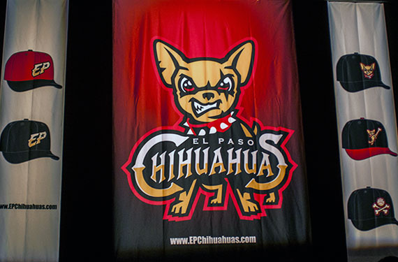
No uniforms unveiled just yet, we can expect to see them in the next couple of months, what we do know courtesy the photo at the top of this post is that there will be 5 different caps to go along with the (probably?) 5 different uniforms.
What are your thoughts on the El Paso Chihuahuas? SportsLogos.Net readers have rated the primary logo as a 6.2 out of 10 so far. Do you agree? Share your thoughts in the comments or add your vote to the ratings here.
